As a true 90s kid, I loved Barbie. I grew up playing with the dolls, collecting the outfits and singing along to the words of ‘Barbie Girl’ by Aqua. From the moment I laid eyes on those glamorous dolls, I knew I was hooked. My bedroom walls were adorned with posters of Barbie, my collection of her dolls was proudly displayed on my Barbie matching bedspread, and I even had a special Barbie-inspired corner where I spent countless hours daydreaming about my own adventures in the pink Barbie Dreamhouse.
The Barbie fever didn’t stop with the dolls alone; I embraced the entire Barbie universe with unwavering enthusiasm. Barbie had become an integral part of my life, igniting my imagination and inspiring me to dream big from such a young age.
Beyond the enchanting world of play, what truly made Barbie an icon was the powerful brand story it carried. From the beginning, Barbie stood as a symbol of femininity and empowerment, breaking through societal norms and encouraging girls to envision limitless possibilities for themselves. As a brand, Barbie emphasised the importance of individuality, ambition, and self-expression – values that continue to resonate with generations of girls even today.
Table of Contents
The Brains Behind The Barbie Girl
As you probably know, Barbie belongs to the Mattel toy giant. But she’s much more than just a successful product. She’s the reason Mattel exists in the first place!
Mattel was founded by Ruth and Elliot Handler in 1945. Ruth was a Polish Jewish immigrant who moved to the US with her family and was the youngest of 10 children. She met her husband Elliot in 1938, and together they traversed the ordeal of World War II.

At the age of 30, she had big visions and big ambitions, and Elliot supported her all the way, even founding the company with her. Ruth was well known to be a visionary woman with a talent for analysing subtle signs in the marketplace, identifying potential innovations and then developing strategic breakthroughs.
Who would have thought that her talents would create the blonde bombshell who is now the most popular and highest-grossing doll of all time?
Where Barbie Began
One of Ruth’s deepest desires was to make a toy for girls. One that wasn’t just a housewife or mother character, which is all that was available at the time. On a trip to Switzerland in 1956, Ruth spotted a doll in a shop window. She immediately saw the potential in the doll, and she bought three of them to bring home and show her husband.
The doll she saw was of Bild Lilli – a German doll based on a cartoon of the same name. But unlike the Barbie we would all come to know and love, Bild Lilli was a little more… mature. The cartoon strip featured Lilli as a sex-kitten – an uninhibited, witty and independent woman who supported herself as a secretary and often dated older men for their money. She was featured in all sorts of risqué situations, and there was a huge market for adult dolls with her likeness.
Ruth didn’t care about any of that. She didn’t fall in love with Lilli for her backstory, she saw the potential for a sensational new toy – and her young daughter Barbera agreed. Despite a lot of resistance from advertising agencies and even her own executive board, Ruth convinced the Mattel R&D department to make the very first Barbie doll. And as soon as Ruth presented it to the public, the rest is history.
Life Beyond The Home
One of the reasons that Barbie was so popular is that she was the first doll to show girls a life outside of the home. Up until that point, all dolls were designed as ‘homemaker’ toys, with accessories for cooking and cleaning and raising children, but not a lot else. Barbie turned that idea on its head and presented kids with a doll who dared to do more.
To date, Barbie has had over 200 careers (there’s a full list here), with new ones added to reflect current events. She’s been everything from a fashion model to an astronaut, a game developer and even a construction worker. The current line-up of careers added in 2023 includes dentist, fashion boutique owner, panda rescuer, pastry chef, stylist, tennis player, volleyball player and wardrobe stylist.
Barbie has become a symbol of female empowerment, showing girls around the world that they can be whatever they want to be. In that way, Ruth’s dream of showing girls a life outside the home has been the most successful mission on earth.
She’s also an ever-changing reflection of the times. As fashion and trends have moved on through the decades, Barbie has moved with them. It’s one of the big reasons this little doll has lasted for the last 64 years, and will no doubt continue for many more. There’s definitely something brands can learn there!
The Barbie Legacy
64 years on, Barbie is still a household name. Parents grew up playing with them, and their daughters are still asking for Barbie dolls to play with. As a brand, they have kept a very open mind about not only trends, but the changing landscape of the world and consumer market.
Barbie is always on-point, and her collection of friends has provided a valuable way to expand the universe and prove the inclusivity of the product. One of the first-ever black dolls, named Christie, was released in 1968, and in 1980 they released their first Black and Hispanic dolls named Barbie. In response to criticism about the unrealistic beauty standards Barbie portrayed, Mattel released a range of 9 different body types.

At the time of writing, Mattel produces Barbies with 35 different skin tones, 97 different hairstyles and 9 different body types. You can buy a Barbie in a wheelchair, with a prosthetic leg and hearing aids. And their latest release? A Barbie with Down Syndrome. Mattel has always said that they have a commitment to reflecting the world around them in Barbie’s universe, and that is one of the things that has kept them so relevant through so much societal change.

Maybe that’s what sets them apart. Little girls for 64 years have been able to see themselves within these little pieces of plastic, and as they have got older, their beloved Barbie has shown that she loves them back. Nostalgia is a powerful thing, and when a brand shows such a commitment to improving themselves and the world around them, it’s difficult to ignore.

Even though she passed away in 2002, in my opinion, Ruth Handler is one of those women who aren’t as celebrated as she should be. She was an independent, creative and powerful woman and a true model of female leadership. And ultimately, a much more important and interesting role model than her beloved Barbie.
The Evolution of the Barbie Logo
Over the years, the logo design has undergone several evolutions, yet key elements have been beautifully preserved, ensuring its timeless appeal and maintaining the essence of the iconic brand. The journey of the Barbie logo is a testament to the power of staying true to one’s origins, a principle that has propelled this signature brand to endure and remain as captivating as ever.
💖 1959 to 1975 ~ The Original

The first Barbie logo boasted a cursive font that exuded distinctiveness and memorability, gracing the company’s identity for more than 15 years. A charming touch was added by slightly lowering the first letter in contrast to the rest of the word, and the non-uniform heights of the letters both at the top and bottom, resulting in a delightful and whimsical air that perfectly captured the playful essence of the brand.
💖 1975 to 1991 ~ The 3D Version

The second logo for the Barbie brand marked a significant departure from its predecessor, as the company sought to modernise its image. Retaining the familiar brand colours, the new logo adopted a three-dimensional shape.
In this fresh design, the letters were all in lowercase, with the first letter still capitalised, and thoughtfully aligned in a consistent line. To infuse the logo with an air of cheerfulness and joy, the designers opted for a slight upward slant.
Notably, the shadows cast by the letters were exaggerated and deviated from their actual shapes, adding an intriguing touch to the overall design. The result was a logo that captured both a modern sensibility and a delightful playfulness. Interestingly, this logo has been reused for the 2023 Barbie film starring Margot Robbie and Ryan Gosling.
💖 1991 to 1999 ~ Back to Flat

After proudly sporting the large 3D logo for a remarkable 16-year span, Barbie recognised the need for a fresh redesign. Embracing a more refined and lively approach, the new logo bid farewell to the hefty shadows and introduced subtle adjustments to the Barbie logo font, notably enhancing the grace and charm.
Accompanying this transformation was a shift in the colour palette, opting for a more subdued and soothing range of pastel shades. This departure from the vibrant deep pink brought a touch of elegance and sophistication to the brand’s visual identity. The result was a logo that exuded renewed vibrancy and contemporary appeal, staying true to Barbie’s timeless essence while embracing the allure of the present.
💖 1999 to 2004 ~ Back to Cursive

For the next Barbie logo redesign, the brand maintained the distinctive capitalisation and slant of the previous version. However, they decided to revisit the original charm by reverting to an italic Barbie logo font, reminiscent of the initial design.
Connecting all the letters together, the new logo boasts a delightful, hand-drawn appearance, infusing a sense of personalisation and warmth. While the colour was tweaked slightly to a marginally brighter hue, the continuity of using a single captivating colour throughout the logo remained steadfast. This evolution effortlessly captures the essence of Barbie’s timeless appeal while embracing a touch of artistic finesse and individuality.
💖 2004 to 2005 ~ Flower Power

Regrettably, this particular version of the Barbie logo had a short-lived existence, lasting merely one year. The initial letter featured a sweeping cursive arc, while the dot of the “i” was ingeniously transformed into a charming five-petal flower design. This childlike approach was intended to appeal to the company’s primary target audience of children. However, opinions arose that it lacked a certain level of sophistication, leading to its swift replacement after just one year.
In this iteration, the Barbie logo font moved away from cursive, returning to a more handwritten style, and the slanted design was removed. These adjustments significantly enhanced the logo’s legibility and its effectiveness in captivating a younger audience. Additionally, a subtle shift in colour returned to a brighter pastel pink, contributing to a more vibrant and playful appearance. Despite its short tenure, this version of the logo reflected the brand’s continuous efforts to evolve and adapt to meet the preferences of its audience while staying true to its iconic essence.
💖 2005 to 2009 ~ A Quick Update

This logo bears a striking resemblance to its predecessor, with only slight modifications. The five-petal flower was replaced with a simple dot atop the letter “i,” adding a touch of refinement to the design. Furthermore, the colour palette was enhanced, showcasing a deeper pink shade that seamlessly stands out and captivates the eye. The subtle changes in this iteration demonstrate the brand’s commitment to maintaining its recognisable identity while infusing a fresh and modern touch.
💖 2009 to Today ~ Back to the Original
With meticulous attention to detail, Barbie has revisited its iconic 1959 appearance. This design concept beautifully encapsulates the essence, aesthetics, and symbols that define Barbie’s identity. Amidst the various evolutions of the Barbie logo, the decision to return to its original emblem holds deep significance for the brand’s journey. It’s a powerful testament to the concept of going back to one’s roots!
Throughout its evolution, Barbie has kept its audience engaged and embraced innovation while remaining true to its origins, signifying a harmonious balance between timeless heritage and contemporary vision.
Final Thoughts: Inspiring Young Minds & Empowering Big Dreamers
Over its illustrious six-decade history as a toy manufacturer, the Barbie company has undergone multiple logo changes, demonstrating the significance of innovation alongside unwavering consistency in successful branding. While it has had its fair share of controversy and backlash, the Barbie doll remains one of the most common and best-selling toys ever made.
With their knowledge and history, the confidence to connect with their roots, and the desire to learn from the past, Mattel’s Barbie remains at the top of the industry. As a Brand Alchemist, I appreciate the thoughtful evolution of the Barbie logo, each version capturing the brand’s essence while embracing contemporary trends.
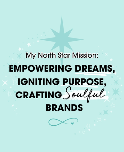
Barbie’s enduring symbol of strength, ambition, and resilience continues to inspire countless dreamers and achievers, and her commitment to empowering young minds through imaginative play leaves a lasting impact. Leading with your ‘why’ and staying true to your core values can create a profound influence on the world. As I carry forward this empowering spirit into my own work, my north star mission is to help others discover the magic of their brand stories and embrace the power of their ‘why’ to create an unforgettable legacy.
 FAQs
FAQs 
Back in 1959, the toy company, Mattel made a splash with the introduction of the first-ever Barbie doll, accompanied by a vibrant pink wordmark. The bespoke cursive design featured subtly curved letters, and the capitalised and enlarged “B” added a distinctive touch. Notably, the left side of the letter remained straight, giving the logo a unique flair.
Barbie’s brand story exemplifies the importance of embracing change and innovation while staying true to the brand’s core values and mission. Businesses can learn from Barbie’s journey to adapt to evolving trends, connect with their audience on a deeper level, and create a lasting legacy that transcends time. Leading with authenticity and purpose can elevate a brand’s impact and pave the way for long-term success.
Throughout its logo evolution, Barbie’s commitment to maintaining certain design elements and colour palettes contributed to a sense of familiarity and brand recognition. Elements like the iconic pink colour, distinct typography, and the capitalisation of the initial “B” were retained in various iterations, ensuring continuity.
Barbie has faced criticism and controversy over certain logo designs, but the brand’s core values and enduring appeal have allowed it to withstand these challenges. The company’s ability to listen to feedback, adapt, and learn from past experiences has contributed to its continued success and iconic status.
…
Follow for more tips & tricks…👇✨
Instagram | The Canva Coven | YouTube | Newsletter
∞